Sunday, March 27, 2011

Domesticating Griffin

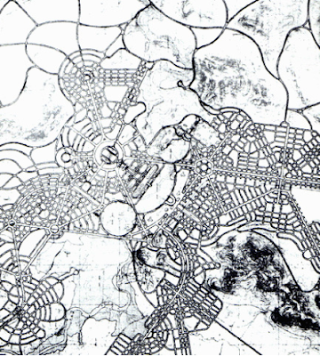
One sunny morning last year I visited Castlecrag. Castlecrag is over the bridge in North Sydney and is the location of many of Walter Burley Griffin's homes that he and his wife, Marion Mahony (a very talented architect, who could draw amazingly!) designed together after the kafufle that happened over the design of the Australian Capital Territory (ACT). On a side note, the ACT we know today isn't exactly how Griffin intended it to be. That's why descriptions of Canberra are less than favourable.  The ACT was designed by a number of architects hiding behind Griffin's name. Since when do architects let another take all their credit?


Griffin's original plan for the ACT
www.teachingheritage.nsw.edu.au/section07/b_index.php

Anyway, so Griffin and his wife spent their time designing very unique houses that used the all new knitlock system. These houses and their neighbourhood are really cool! 


Flat roofs

Stone knitlock

The marriage of the natural landscape and building

A beautiful gate!

The hospital, peach render not original..

Unlike the strong axis that define Canberra, Castlecrag hasn't a straight road in it. There are also heaps of Cul de Sacs with small islands of natural flora. Power lines are buried which was a very radical idea at that time. The most impressive thing though was the public paths that cut behind and through people's homes and the reservations that are open to people's backyards.


Griffin's plan for Castlecrag

Wednesday, March 23, 2011

Guts and holy places

For the last semester ever of my degree, my fellow students and I each had to design an anatomy theatre. The site was located in Prague. It was an unconsecrated church that they now use for concerts and other pagan things. Anyway, to design a space for cutting up dead people in a church was really interesting, as you could probably imagine. 


We had to explore the "inside" and the "outside" and were encouraged to view the church as a fabric that we could cut into and manipulate in any way we wanted. Out of my three years at uni, this design project was by far the most interesting. At the end of the semester the tutors make us submit a portfolio of the progress we have made over the semester. I discovered I could embed my online portfolio onto blogspot, so here it is.


Monday, March 21, 2011

A very well behaved restaurant

I can cross it off my To do list. I've dined at Sydney's temporary restaurant called Greenhouse by Joost. It's a sustainable building characterised by three orange shipping containers and a living/edible wall of stacked strawberries. The inside is tasteful and fresh, going for a very hip style. The interior walls were white with black scrawled words  describing food, sustainability and the restaurant. From what I could see there were no lights, so when daylight was no more, they brought out tea light candles for each table. It was back to basics. 


Photo by my sister's friend.

Everything looked like it was made from recycled materials. The floor was black rubber, I'm guessing recycled tires. The chairs were constructed of a roughly welded steel frame with a leather backing and seat. They were not very comfortable. The tables tops looked as if they were constructed of old signs. The drinking glasses were jars and the beer glasses were the bottom half of an old beer bottle melted at the rim, making it look like resin (hello Dinosaur Design). Plates were not plates but squared off pieces of plywood. The cutlery was also timber. We wondered why, since they couldn't be reused and trees would had have to been knocked down to make them. The place became really packed as dinner time set in. 


The menu was equally healthy, consisting of an assortment of vegetables that looked like they had been picked straight from the garden out back. We had fried cauliflower with spices. It was presented in a newspaper cone sitting in a large jar, reminding me of popcorn for some reason. Then came the baby carrots, presented on a plywood board, a quinoa salad with radishes and finally lamb. We didn't have individual plates, our waitress explained that they had ran out (of plywood I presume) and it was a opportunity to share food with one another.  Very communal. So that's what we did. It was very loving. The meals were a good example of healthy eating and looking after our bodies and the planet. 


It would be nice to think that the temporary construction could fit into those three shipping containers and be transported to another place. But I ruled that out since the containers had great big squares cut out of the side to make a door way to the kitchen and other service spaces. Nevertheless, the orientation of the building was right, smaller facades facing the east and west and large facades to the north and south with large windows on the north and limited openings on the south. I'm not too sure about the living  walls. Sure the walls are edible, but many of the strawberries had died. I think it was just a means of making the building 'look' more sustainable. Anyway, the customer's were endless it seemed and we all got exposed to sustainable design and healthy eating.

Wednesday, March 2, 2011

A plastic architect.

I always loved Barbie dolls as a child. That tall, blonde, skinny lady with the "perfect" body and perfect teeth that continued to smile at you even if your mother had cut her hair off because she thought it was causing allergic reactions in her daughter. Oh the good childhood days when I dreamed of being a vet, a school teacher and a doctor! I am none of those things today. 

Barbie has been all of them though, even a McDonald's check out chick. Finally Mattel is releasing Architect barbie in the "I can be" range in 2011! Children can now dream of being an Architect when they grow up or even play Architects as they would Doctors or Teachers. That's right. Children can stay up drawing, drinking coffee and building models with agonising detail. And then once morning hits, they can drill each other on their projects until parents intervene.

When I first saw images of Architect Barbie, my reaction was "Oh my God!" And then, "Wow do Architects really dress that bad?" Barbie wears an A-line cut dress with a black sash that cinches in the waist, complete with a city skyline on the bust. What is most distressing is the bluish gradient at the bottom. It looks as though it was designed on Photoshop. But enough of my explaining, here's an image.

 Images compliments of target.com

At least Barbie sports the cliche black frame glasses. I wish she was wearing them properly, and not just on her head. Those glasses are hot! I must say the pink drawing tube is rather cute, however unnecessary. And if Barbie is wearing what looks to be stillettos, why on earth is she carrying a hard hat? Surely she isn't going to the site in such inappropriate shoes. We shouldn't forget, this is Barbie we are talking about. 

Barbie can be ordered online from Target, when they get them in stock that is. This is what the description reads:

"Kids can play out the role of architect plus have access to additional online content that allows them to further explore the role. A code inside each package unlocks career-themed content online. The architect doll comes with blueprints and a model house. Doll cannot stand alone."

I'm curious as to what kind of career content is online. But this is good. The Architecture profession will gain more exposure, especially in young girls. In the future, more women in the profession will be able to stand on their own two feet, unlike Barbie. But hey, at least she's trying.